Search This Blog

Tuesday, September 23, 2014

how to align the text middle in div container.

Welcome to designers blog here i have posted how to align the text  middle in div container.

Step1:

 Style:

  div {
      width: 250px;
      height: 100px;
      line-height: 100px;
      text-align: center;
      border: 1px solid #123456;
    }

    span {
      display: inline-block;
      vertical-align: middle;
   
      line-height: normal;
    }


Step2:

Html:

    <div>
      <span>Lorem ipsum dolor sit amet, consectetur adipiscing .</span>
    </div>


Step3:

Enjoy Folks

Thursday, September 11, 2014

CSS Hack

 Safari  and Chrome Css Hack
 
@media screen and (-webkit-min-device-pixel-ratio:0) {
    /* Safari and Chrome */
    .search .button {
        margin-top:0px;
    }

    /* Safari only override */
    ::i-block-chrome,.search .button {
         margin-top:1px;
    }
}


Google chrome only

@media screen and (-webkit-min-device-pixel-ratio:0) {
     .reg-textbx {
    padding: 10px 0 9px 10px;
   }
}

Wednesday, July 16, 2014

CSS Slider

Welcome to designers blog here i have posted If you are looking for a fast and light-weight WYSIWIG image image slider for your clients, http://cssslider.com/ works without any jQuery, nor JavaScript.

Step1:

Go to http://cssslider.com/

Step2: 

Select the banner animation you like

Step3: 

Select the banner animation you like and download the Css slider set up file for windows

Step4:

Just Drag and drop the images and select the animation effects u desire and publish or save the file into html

Step5:

No watermark is applied on this banner. so Enjoy Folks


Sunday, July 6, 2014

how to import local sever database to live server database


Welcome to designers blog here i have posted how to  import local sever database to  live server

database in wordpress


Step1:

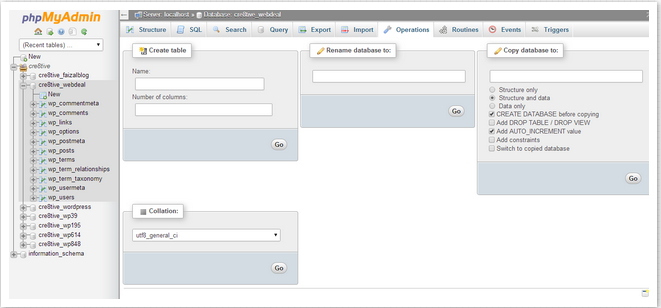
Export the database from local server phpmyadmin - databasename themes


Step2:

 Go to live server - Create new - new Database name - which is start with prefix  Cre8tive_

so we have to give our new database with name called Cre8tive_webdeal


 Step3:
We have to create the username and password for the database


 Step4:

Add user to database selecting in drop-down menu and add


Step5:

Make sure all the privileges tick and  click make changes


Step6:

Go to PhpMyAdmin u will see the added database name - Cre8tive_webdeal


Step7:

Now you have to import the database  themes to live server

 live server database name is Cre8tive_webdeal  and the local database is themes so there is

major different in case you upload it  will get fail


Step8:

To import the local database to live server u have open the export file themes.sql  in the notepad

 or Dreamweaver  editor and change the database  : cre8tive_webdeal


--
-- Database: `cre8tive_webdeal`
--
CREATE DATABASE IF NOT EXISTS `cre8tive_webdeal` DEFAULT CHARACTER SET latin1 COLLATE latin1_swedish_ci;
USE `cre8tive_webdeal`;

Now u can import the file successfully


Step10: 

Changing the Site URL

Now you need to change the site URL, so you can setup your live WordPress site. In your

phpMyAdmin, look for the wp_options table in your database that we just imported in step 4. If you

 changed your database prefix, then instead of wp_options it might be {prefix}_options.

Click on the browse button next to wp_options or the link that you see in the sidebar to open the

page with a list of fields within the wp_options table. See screenshot below:


Under the field options_name, you need to look for siteurl. Click the Edit Field icon which can be

found at the far left at the beginning of the row.


When you click the edit field, an edit field window will appear. In the input box for option_value,

you will see the URL of your local install probably something like: http://localhost/test.

Carefully insert your new site url in this field, for example: http://www.wpbeginner.com Save the

field by clicking the Go button.Next, you need to replicate this step for the option name: home. The

wp_options page can be a few pages long, so simply find the home tab. Usually it is on the second

page which you can navigate to by clicking on the pagination arrows in phpMyAdmin.

Update the home url to be the same as your siteurl.


Step10:

You have to change the WP-config file since you have upload or install WordPress form your local

server files.

Open the Wp-config file and change the

1.define('DB_NAME', 'cre8tive_webdeal'');

2. define('DB_USER', 'cre8tive_web');

3.define('DB_PASSWORD', 'web123');

// ** MySQL settings - You can get this info from your web host ** //
/** The name of the database for WordPress */
define('DB_NAME', 'cre8tive_webdeal');

/** MySQL database username */
define('DB_USER', 'cre8tive_web');

/** MySQL database password */
define('DB_PASSWORD', 'web123');

/** MySQL hostname */
define('DB_HOST', 'localhost');

/** Database Charset to use in creating database tables. */
define('DB_CHARSET', 'utf8');

/** The Database Collate type. Don't change this if in doubt. */
define('DB_COLLATE', '');

Step11:

Now Access the Live url  you will see the similar local server files

Enjoys folks .........................


Saturday, July 5, 2014

Updraged windows 7 to 8 or 8.1 wampserver

Welcome to designers blog here i have posted how to Upgraded wampserver when you upgrade the

operating system to

Step1:

1.Window 7  to windows 8

2. windows 8 to  windows 8.1

Step2:
Click on wampmanager -> MySQL -> Service -> Install Service

Click on wampmanager -> Apache -> Service -> Install Service


Step3:

Then restart all services


Step4:

When Green Symbol comes your Wamp Server in Active . Enjoy Folks.................................

Thursday, June 12, 2014

My first Less.Css file using node.js

Step1:

Create a HTML File  index. html

<!doctype html>
<html>
<head>
<meta charset="utf-8">
<title>Untitled Document</title>

<link type="text/css" href="style.css" rel="stylesheet"/>
</head>

<body>

<header>

<p> i would love to work with  less </p>
</header>

</body>
</html>

Step2:

Denote the style sheet  name whatever u want  ( example : style.css )


<link type="text/css" href="style.css" rel="stylesheet"/>

 Step3:
 
Create a style sheet  name cool.less 

  There are two types of  class

 1. less - @  difference between the both is $ and @ symbols
 2. sass - $


@color:red;
@text-green:green;
div
{
    color:@color;   
}
header
{
    height:80px;
    width:1024px;
}

header p
{
    color:@text-green;
}


Step4 :

Install the node.js in your computer and open the command prompt

you need to install the less module by running

npm install less -g


give the location of your folder ( my folder name is workout)

Cd users\desktop\workout > lessc cool.css > style.css

( if you see in the browser it will show only the style.css in chrome)

 if u want to display the less file in browser we want to give --source- map =style.map

Cd users\desktop\workout > lessc cool.css > style.css --source- map =style.map


Step5 :

Now you can go and see the folder (workout) . style.css and style.map will be generated


Step6 :


Output


Sunday, June 8, 2014

Centered fixed width design in SharePoint 2010


fixed width design in SharePoint 2010

Categories:CSS; SharePoint Designer; Site Manager/Power User; MOSS; WSS; 2007; 2010
There are a lot of fixed width master page solutions available on the internet and I've read most of them. Some require JavaScript or don’t respect the ribbon, which means that the ribbon will be placed inside the fixed width design.

There are a lot of fixed width master page solutions available on the internet and I've read most of them. Some require JavaScript or don’t respect the ribbon, which means that the ribbon will be placed inside the fixed width design. SharePoint is smart enough to handle small screen resolutions by compacting and rearranging the icons in the ribbon, but if a larger screen is used it gets really hard to administer SharePoint and breaks the usability completely.
There is a much quicker and safer way to create a flexible master page where only certain CSS properties need to be changed to get any fixed width design as well as centered design with a border to the left and right.
Reasons for a centered design
There are certain reasons for a centered or fixed width design. By default SharePoint scales the complete page to 100% of the screen. When it comes to web content management the design is more text driven and collaboration concerns are not that relevant. When the content gets wider and wider with the screen resolution the lines of text get longer and longer. The content then will be harder to read.
Fixed width looks pretty but generally only makes sense when public facing web sites should be created. The reason is that you don’t know what the users screen resolution is. Nowadays the most common design requires supporting a minimal resolution 1024px or maybe sometimes 1280px. To be on the safe side most web designer's use grid systems like 960.gs which implements widths of 980px and is optimized for a minimal screen resolution for 1024 by 786.
Fixed design could also be used for blogs and maybe wikis. From a collaboration perspective a 100% width makes more sense. So comment and let me know if you think differently.
Centered Design in SharePoint
As I said before most of the tutorials available on the web don’t respect the ribbon and stuff it into a design that has a fixed width. The fastest way to get a fixed width design I found needs only the following CSS code and is flexible to be changed to any desired width.

div.s4-title.s4-lp,

body #s4-mainarea,

#s4-topheader2,

#s4-statusbarcontainer {


     width: 960px;

     margin: auto;


       padding: 0px;

       float: none;


  background-image: none;

    background-color: white;


 }
To get the fixed width design working with the v4.master some classes needs to be added.
1
<div id="s4-workspace">
Needs to be changed to:
1
<div id="s4-workspace" class="s4-nosetwidth">
And the second html element needs to be altered:
1
<div id="s4-titlerow" class="s4-pr s4-notdlg s4-titlerowhidetitle">
This need to be changed to:
1
<div id="s4-titlerow" class="s4-pr s4-notdlg s4-titlerowhidetitle s4-nosetwidth">
By adding the s4-nosetwidth style class SharePoint won’t assign the inline style property for width and the design will stay centered. The result looks like this:


                                                        960px fixed width design


fixed width with ribbon enabled

At the end the design of SharePoint is centered. When any page is edited the Ribbon will remain on the whole width of the browser. It’s much more comfortable to edit SharePoint that way.
The size of the design could be changed to any size just by simply modifying the width property. Remember always respect the size of the ribbon and let it live outside your design for easy editing.


Custom Master Page Design:

body #s4-mainarea,
 #s4-topheader2,
 #s4-statusbarcontainer {
     width: 1024px!important;
     margin: auto;
     padding: 0px;
     float: none;  
}

 .ms-dialog #s4-mainarea, .ms-dlgFrame #s4-mainarea {
    width:auto!important;
}
 .ms-dialog .content-wrapper
 {
    background:none;
  
}
.ms-dialog {
     overflow:auto;
}
 div #s4-titlerow {
    width: 1024px!important;
     margin: auto;
     padding: 0px;
     float: none;
  
     background-color: white;

}


Validating to select in sequencial order using angular

    < input type = "checkbox" (change) = "handleSelectTaskItem($event, taskItem)" [checked] = " taskItem . i...