Welcome to Designers dairy blog,Here we are going to discuss about,
How to Turn SharePoint Summary Web part link as an accordion Menu
Step1:
Add the summary link webpart in Sharepoint ribbon
Webpart - > Content Rollup - > Summary Links
- New Link: Click this button to link to a new item in the Web Part. You can link to a page, item, or person. You can also link to content outside SharePoint.
- New Group: Create a new group that you can use to group the links you add to the Web Part.
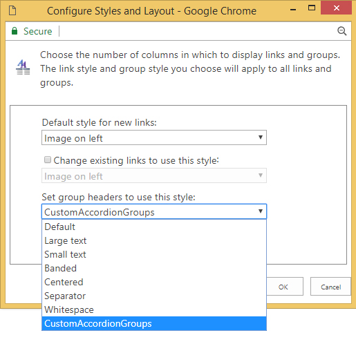
- Configure Styles and Layout: Select the default style that’s applied to new links or change the style on all links you already entered into the Web Part.
- Reorder: Move the items in the Web Part up or down to change the order.

Step2:
Let us see, how to customize and add the new group header style in configure styles and layout.
Now, we are going to add the custom group header style called CustomAccordionGroups as shown in below image
Step3:
To add the custom style CustomAccordionGroups . You have to add in Header.xsl file.
which is located in the below path :
Style Library/XSL Style Sheets/Header.xsl
Open the Header.xsl file and add the below XML template code with the class
name CustomAccordionGroups
<xsl:template name="CustomAccordionGroups" match="*[@GroupStyle='CustomAccordionGroup']" mode="header">
<div class="groupheader item accordionCustomHeaderItem">
<xsl:call-template name="OuterTemplate.GetGroupName">
<xsl:with-param name="GroupName" select="@*[name()=$Group]"/>
<xsl:with-param name="GroupType" select="$GroupType"/>
</xsl:call-template>
</div>
</xsl:template>
Once you added, you will find the custom style CustomAccordionGroups in the drop down list
Step4:
Once you applied the CustomAccordiongroup to the Headers
Now I am going to making this web part into a fully functional accordion for this I added a
CustomAccordiongroup.
Simple Jquery script the performs hide all hyperlinks in this groups and when a user clicks a group header, hide all sections that is not the current header and expand current selected link selection.
So, adding the jquery library Reference
<script src="https://ajax.googleapis.com/ajax/libs/jquery/3.3.1/jquery.min.js"></script>
Script:
$(document).ready(function(){
$('.accordionCustomHeaderItem').click(function(){if( $(this).hasClass('active') ){
$(this).removeClass('active');
$(this).next().removeClass('show');
}else{
$('.accordionCustomHeaderItem').removeClass('active');
$('.accordionCustomHeaderItem + ul.dfwp-list').removeClass('show');
$(this).addClass('active');
$(this).next().addClass('show');
}
})
});
CSS:
{
display:none;
}
.groupheader {
background-color: #921c1c;
color: white;
font-family: "Segoe UI", Tahoma, Geneva, Verdana, sans-serif;
font-size: 140%;
padding: 0.5em;
padding-left: 15px;
margin-right: 0.5em;
margin-bottom: 1px;
}
.accordionCustomHeaderItem:before {
font-family: 'FontAwesome';
content: "\f054";
font-size: 13px;
padding-right:12px;
padding-top: 6px;
float: left;
}
.accordionCustomHeaderItem.active:before {
content: "\f078";
font-size: 13px;
padding-top: 6px;
float: left;
}
.groupheader-arrowdown {
color: white;
font-family: "Segoe UI", Tahoma, Geneva, Verdana, sans-serif;
font-size: 140%;
padding: 0.5em;
padding-left: 35px;
margin-right: 0.5em;
margin-bottom: 1px;
}
.groupmarker:hover .groupheader{
cursor: pointer;
background-color: #e03628;
}
.dfwp-list {
margin-bottom: 0.5em;
margin-right: 0.75em;
}
.dfwp-list .item:hover {
text-decoration:underline;
}
.dfwp-list .link-item a {
margin-left: 2em;
color: black;
}
.show {
display:block !important;
}
Step5:
So Finally, Now you can able to see your web part work as an Accordion menu as shown below

So Finally, Now you can able to see your web part work as an Accordion menu as shown below

Thanks for reading my article.Stay Tune on www.webdesignersdairy.com for more updates on SharePoint.

No comments:
Post a Comment