Search This Blog

Wednesday, September 12, 2018

Awesome input focus effects using css3


Step1:

Welcome to designer blog, here we are going to discuss about,  How to make the awesome input focus effects using css3

Step2:

To make the input focus effect jquery plays the important role to add and remove the css. There are two methods in jquery play an important roles focus in and focus out.

<script>
// JavaScript for label effects only
$(window).load(function(){
$(".input-effect input").focusin(function(){
console.log("focus in");   
if($(this).val() != ""){
$(this).removeClass("new");
}
else {
$(this).addClass("has-content");
}
})
$(".input-effect input").focusout(function(){   
console.log("focus out");
if($(this).val() != ""){
//$(this).addClass("new");
$(this).removeClass("has-content").addClass("has-new");
}
else {
$(this).removeClass("has-content").removeClass("has-new");;
}
})
});
</script>

Step3:

Below are the source code for awesome input focus effects using css3

Html Markup

<!DOCTYPE html>
<html>
<head lang="en">
<meta charset="UTF-8">
<meta name="viewport" content="width=device-width, initial-scale=1">
<title>Awesome input focus effects using css3 - usingcss3</title>
<link href='https://fonts.googleapis.com/css?family=Lato:400,300,700,900' rel='stylesheet' type='text/css'>
<!-- CSS includes -->
<link rel="stylesheet" type="text/css" href="css/input-style.css">
<!-- CSS includes end -->
</head>
<body>
<div class="row">
    <div class="container">   
                <h2>Input with Label Effects</h2>
        <div class="col-3 input-effect">
        <input class="effect-16" type="text" placeholder="">
            <label>First Name</label>
            <span class="focus-border"></span>
        </div>
        <div class="col-3 input-effect">
        <input class="effect-16" type="text" placeholder="">
            <label>First Name</label>
            <span class="focus-border"></span>
        </div>
        <div class="col-3 input-effect">
        <input class="effect-16" type="text" placeholder="">
            <label>First Name</label>
            <span class="focus-border"></span>
        </div>        
    </div>
</div>
<!-- Script here -->
<script src="https://code.jquery.com/jquery-2.2.3.min.js"></script>
<script>
// JavaScript for label effects only
$(window).load(function(){
$(".input-effect input").focusin(function(){

console.log("focus in");


if($(this).val() != ""){
$(this).removeClass("new");
}
else {
$(this).addClass("has-content");
}
})

$(".input-effect input").focusout(function(){
  
console.log("focus out");
if($(this).val() != ""){
//$(this).addClass("new");
$(this).removeClass("has-content").addClass("has-new");
}
else {
$(this).removeClass("has-content").removeClass("has-new");;
}
})
});
</script>
</body>
</html>

Css: 

/*= Reset CSS 
============= */
html, body {border: 0; margin: 0; padding: 0;}
body {font: 14px "Lato", Arial, sans-serif; min-width: 100%; min-height: 100%; color: #666;}
.container{margin: 0 auto; max-width: 1200px;}
*{margin: 0; padding: 0; box-sizing: border-box;}
.row{float: left; width: 100%; padding: 20px 0 50px;}
h2{text-align: center; color: #2079df; font-size: 28px; float: left; width: 100%; margin: 30px 0; position: relative; line-height: 58px; font-weight: 400;}
h2:before{content: ""; position: absolute; left: 50%; bottom: 0; width: 100px; height: 2px; background-color: #2079df; margin-left: -50px;}
/*= Reset CSS End
================= */

/*= input focus effects css
=========================== */
:focus{outline: none;}


.col-3{float: left; width: 27.33%; margin: 40px 3%; position: relative;} /* necessary to give position: relative to parent. */
input[type="text"]{font: 15px/24px "Lato", Arial, sans-serif; color: #333; width: 100%; box-sizing: border-box; letter-spacing: 1px;}


.effect-16, 
.effect-17, 
.effect-18{border: 0; padding: 4px 0; border-bottom: 1px solid #ccc; background-color: transparent;}

.effect-16 ~ .focus-border{position: absolute; bottom: 0; left: 0; width: 0; height: 2px; background-color: #3399FF; transition: 0.4s;}
.effect-16:focus ~ .focus-border,
.has-content.effect-16 ~ .focus-border{width: 100%; transition: 0.4s;}
.effect-16 ~ label{position: absolute; left: 0; width: 100%; top: 9px; color: #aaa; transition: 0.3s; z-index: -1; letter-spacing: 0.5px;}
.effect-16:focus ~ label, .has-content.effect-16 ~ label{top: -16px; font-size: 12px; color: #3399FF; transition: 0.3s;}

/*= input focus effects css End
=============================== */

.has-new.effect-16 ~ .focus-border
{
width: 100%; 
       transition: 0s !important;
background-color:#ccc;border: none;
height: 1px;
}
.has-new:focus ~ label, .has-new.effect-16 ~ label
{
top: -16px; 
font-size: 12px; 
color: #3399FF; 
transition: 0s !important;
}

Step4 :

Output


Thanks for reading article.Stay Tune on www.webdesignersdairy.com  for more updates.

Tuesday, September 11, 2018

bootstrap collapsible menu is not collapsing after another panel is selected

Step1:

Welcome to designer blog, here we are going to discuss about,  How to make the current collapse panel open when another panel is selected or clicked  without closing the previous panel.


Step2:

In Bootstrap Default Mark-up come with class Panel-group and Id = "accordion". This  id accordion will be called in each item of panel heading as the data-parent (Data - Attribute)  with below code

 <a role="button"  data-parent="#accordion" data-toggle="collapse" href="#collapseOne" aria-expanded="true" aria-controls="collapseOne" class="trigger collapsed">
          Collapsible Group Item #1
        </a>

Bootstrap collapsible menu works default as When the current  panel is opened and if you want to  Click on other panel will be closing previous panel and opening the current one.


Html Markup: 

 <div class="panel-group" id="accordion" role="tablist" aria-multiselectable="true">

  <div class="panel panel-default">
    <div class="panel-heading" role="tab" id="headingOne">
      <h4 class="panel-title">
        <a role="button"  data-parent="#accordion" data-toggle="collapse" href="#collapseOne" aria-expanded="true" aria-controls="collapseOne" class="trigger collapsed">
          Collapsible Group Item #1
        </a>
      </h4>
    </div>
    <div id="collapseOne" class="panel-collapse collapse" role="tabpanel" aria-labelledby="headingOne">
      <div class="panel-body">
        Lorem ipsum dolor sit amet, consectetur adipisicing elit. Sequi molestiae dolorum, soluta temporibus vero perferendis quo odit eaque cum fugiat nihil earum error vitae libero nostrum sed ipsam, beatae ea.
      </div>
    </div>
  </div>

  <div class="panel panel-default">
    <div class="panel-heading" role="tab" id="headingTwo">
      <h4 class="panel-title">
        <a role="button" data-parent="#accordion"  data-toggle="collapse" href="#collapseTwo" aria-expanded="true" aria-controls="collapseTwo" class="trigger collapsed">
          Collapsible Group Item #2
        </a>
      </h4>
    </div>
    <div id="collapseTwo" class="panel-collapse collapse" role="tabpanel" aria-labelledby="headingTwo">
      <div class="panel-body">
        Sunt quia aperiam, officiis tempora quis quasi fugit ab ipsa quo expedita reiciendis quod iusto! Enim delectus unde voluptatem officiis molestiae repudiandae.
      </div>
    </div>
  </div>
</div>

 </div>


Step3:

As per our scenario,  when the current  panel is opened and if you want to click on other panel it should not closing  the previous panel and opening the current one. Opened panel should be close by toggling effect.

 for this you have to remove the  below div as well as  data-parent="#accordion"

 <div class="panel-group" id="accordion" role="tablist" aria-multiselectable="true">


Step4:

Output:


Thanks for reading my article.Stay Tune on www.webdesignersdairy.com  for more updates on SharePoint.


Friday, May 25, 2018

How to Turn SharePoint Summary Web part link as an accordion menu

Welcome to Designers dairy blog,Here we are going to discuss about, 

How to Turn  SharePoint Summary Web part  link as an accordion Menu


Step1:

Add the summary link webpart in Sharepoint ribbon

Webpart - > Content Rollup - >  Summary  Links

The Summary Link Web Part has a toolbar along the top, with these four options:
  • New Link: Click this button to link to a new item in the Web Part. You can link to a page, item, or person. You can also link to content outside SharePoint.
  • New Group: Create a new group that you can use to group the links you add to the Web Part.
  • Configure Styles and Layout: Select the default style that’s applied to new links or change the style on all links you already entered into the Web Part.
  • Reorder: Move the items in the Web Part up or down to change the order.
As shown in below images


Step2:

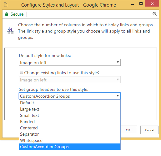
Let us see, how to customize and add the new group header style in configure styles and layout.

Now, we are going to add the custom group header style called CustomAccordionGroups as shown in below image


Step3:

To add the custom style CustomAccordionGroups . You have to add  in Header.xsl file.

which is located in the below path :

Style Library/XSL Style Sheets/Header.xsl

Open the Header.xsl file and add the below XML template code  with the class
name CustomAccordionGroups

 <xsl:template name="CustomAccordionGroups" match="*[@GroupStyle='CustomAccordionGroup']" mode="header">
<div class="groupheader item accordionCustomHeaderItem">
<xsl:call-template name="OuterTemplate.GetGroupName">
<xsl:with-param name="GroupName" select="@*[name()=$Group]"/>
<xsl:with-param name="GroupType" select="$GroupType"/>
</xsl:call-template>
</div>
</xsl:template>

Once you added,  you will find the custom style CustomAccordionGroups in the drop down list


Step4:

Once you applied the CustomAccordiongroup to the Headers

Now I am going to making this web part into a fully functional accordion for this I added a 
CustomAccordiongroup.

Simple Jquery script the performs hide all hyperlinks in this groups and when a user clicks a group header, hide all sections that is not the current header and expand current selected link selection. 

So, adding the jquery library Reference
<script src="https://ajax.googleapis.com/ajax/libs/jquery/3.3.1/jquery.min.js"></script>

Script:

$(document).ready(function(){
$('.accordionCustomHeaderItem').click(function(){
   if( $(this).hasClass('active') ){
    $(this).removeClass('active');
    $(this).next().removeClass('show');
  }else{
    $('.accordionCustomHeaderItem').removeClass('active');
    $('.accordionCustomHeaderItem  + ul.dfwp-list').removeClass('show');

    $(this).addClass('active');
    $(this).next().addClass('show');
  }

})

});

CSS:

.accordionCustomHeaderItem  + ul.dfwp-list
{
display:none;

}
.groupheader {
       background-color: #921c1c;
color: white;
font-family: "Segoe UI", Tahoma, Geneva, Verdana, sans-serif;
font-size: 140%;
padding: 0.5em;
padding-left: 15px;
margin-right: 0.5em;
margin-bottom: 1px;
}

.accordionCustomHeaderItem:before {

    font-family: 'FontAwesome';
    content: "\f054";   
    font-size: 13px;
    padding-right:12px;
    padding-top: 6px;
    float: left;

}

.accordionCustomHeaderItem.active:before {
     content: "\f078";
     font-size: 13px;
     padding-top: 6px;
     float: left;
}

.groupheader-arrowdown {

        color: white;
font-family: "Segoe UI", Tahoma, Geneva, Verdana, sans-serif;
font-size: 140%;
padding: 0.5em;
padding-left: 35px;
margin-right: 0.5em;
margin-bottom: 1px;

}

.groupmarker:hover .groupheader{
cursor: pointer;
background-color: #e03628;
}

.dfwp-list {

margin-bottom: 0.5em;
margin-right: 0.75em;
}
.dfwp-list .item:hover  {

   text-decoration:underline;

}
.dfwp-list .link-item a {
margin-left: 2em;
color: black;
}
.show {

display:block !important;
}


Step5:

So Finally, Now you can able to see your web part work as an Accordion menu as shown below


Thanks for reading my article.Stay Tune on www.webdesignersdairy.com  for more updates on SharePoint.

Wednesday, May 9, 2018

How to make SharePoint Top navigation menu responsive in 2013 & 2016

Step1 :

Welcome to Designer dairy, Here we are going to discuss how to make SharePoint
Top navigation menu as responsive in 2013 & 2016 without installing 

"SharePoint Responsive UI Package"

Step 2:

There are some existing projects built in SharePoint 2013. where the client wish to make it portal responsive.As of now, Here we are not going to discuss about entire portal responsiveness only top navigation menu.

Step 3:


Search for “DeltaTopNavigation” in settle.master and select whole tag > Copy the code and place in between bootstrap navigation tags like below


Step 2-

Place these css in you css file-
/*************************************************************************/
.static,.dynamic {
    padding-left: 10px;
    padding-right: 10px;
}
.ms-core-listMenu-horizontalBox li.static > .ms-core-listMenu-item
{                margin-right:0px!important;
}
ul.dynamic li:hover {
    background-color: red;
}
.static.menu-item.ms-core-listMenu-item.ms-displayInline.ms-navedit-linkNode:hover {
    background-color: red;
}
.ms-core-listMenu-horizontalBox li.static > a{
display: none !important;
}
.ms-core-listMenu-horizontalBox li.static > ul a{
display: block !important;
}
@media screen and (max-width:767px) {
.ms-core-listMenu-horizontalBox ul, .ms-core-listMenu-horizontalBox li, .ms-core-listMenu-horizontalBox .ms-core-listMenu-item, .ms-core-listMenu-horizontalBox > ul > li > table
{
               
                display:block;
}
.hideonsmall
{
                display:none;
}
.navbar-inverse .navbar-toggle:hover, .navbar-inverse .navbar-toggle:focus {
    background-color: transparent!important;
}
.navbar-inverse .navbar-toggle {
    border-color: transparent!important;
}
.navbar-nav {
    margin: 7.5px -15px;
    padding-left: 15px!important;
    line-height: 25px!important;
}
.ms-core-listMenu-horizontalBox {
    color: #666666;
    display: inline-block;
    vertical-align: middle;
    line-height: 30px;
    height: auto;
}.ms-core-listMenu-horizontalBox {
                width:100%;
}.static, .dynamic {
    padding-left: 0px!important;
    padding-right: 0px!important;
}.menu-item-text {
    padding-left: 10px;
}
.navbar-collapse  {
                padding-left: 0px!important;
}
ul.dynamic
{
                left:25%!important;
}
}
Step4:

The final output of the screen will be like below screen.


Thanks for reading my article.Stay Tune on www.webdesignersdairy.com  for more updates on SharePoint.

Thursday, May 3, 2018

Creating News Ticker in SharePoint list item Using JSOM

Step1:

Welcome to the designers dairy blog, Here we are going to discuss, how to Create SharePoint 2013 & 2016 list  items into News Ticker using JSOM.

Step2:

Create a list name called Announcement as shown in below image


Step3:

The news lists have two feeds.


Step4:

Below are the code written in javascript function  Tickernews()  to retrieve  data from the list items using CAML Query. And Appending in the page  where u needed.


$(function () {

    ExecuteOrDelayUntilScriptLoaded(Tickernews, "sp.js");

});
  

function Tickernews() {

    var clientContext = new SP.ClientContext();

    var oList = clientContext.get_web().get_lists().getByTitle('Annoucement');

    var camlQuery = new SP.CamlQuery();    

    //camlQuery.set_viewXml("<View><RowLimit>1</RowLimit></View>"); 

   //camlQuery.set_viewXml("<View><Query><Where><BeginsWith><FieldRef Name='FirstName'/><Value Type='Text'>Raja</Value></BeginsWith>"

   //                    + "<Gt><FieldRef Name='ID' /><Value Type='Counter'>2</Value></Gt></Where></Query></View>"); 
   

 /*camlQuery.set_viewXml("<View>"

    +"<Query>"
   +"<Where>"
     +" <Or>"
     + "   <Eq>"
           +" <FieldRef Name='FirstName' />"
           +" <Value Type='Text'>Raja</Value>"
        +" </Eq>"
        +" <Gt>"
         +"   <FieldRef Name='ID' />"
          +"  <Value Type='Counter'>3</Value>"
        +" </Gt>"
      +"</Or>"
   +"</Where>"
+"</Query>"


 +"</View>");  */

   camlQuery.set_viewXml("<View><RowLimit>1</RowLimit></View>");
    
    this.collListItem = oList.getItems(camlQuery);

    clientContext.load(collListItem);

    clientContext.executeQueryAsync(Function.createDelegate(this, this.onTickerSucceeded), Function.createDelegate(this, this.onTickerQueryFailed));

}

function onTickerSucceeded(sender, args) {

    var listItemInfo = '';

    var listItemEnumerator = collListItem.getEnumerator();
    
    console.log(listItemEnumerator);

    while (listItemEnumerator.moveNext()) {

        var oListItem = listItemEnumerator.get_current();


        listItemInfo += '<div style="float:left; width:25%;"><strong>'+ oListItem.get_item("Title") + '</strong> </div> ' + '<div style="float:left; width:75%;"><marquee>' + oListItem.get_item("ShortDescription")  + '</marquee>'

         '<br />';

    }
    console.log(listItemInfo);

    $("#divListItems").html(listItemInfo);
    
     console.log($(".o365cs-nav-centerAlign"));

}

function onTickerQueryFailed(sender, args) {

    alert('Request failed. ' + args.get_message() +

    '\n' + args.get_stackTrace());

}


Step5:

By Using console log window, we can check the list items are retrieving or not.


    var listItemEnumerator = collListItem.getEnumerator();

If you give the Stored variable   listItemEnumerator in console window.

You fill find

 1.Sp.ArrayList Enumerator  and click - >SpClientObjectData - >  Sharepoint list items will be display  as shown in below screenshot


Title : "Vote Now"

Short_xo220_Description  :  "Vote for favourite Year"

Note : due to space  in list item column xo220 is added


Step6:

Output


Thanks for reading my article.Stay Tune on www.webdesignersdairy.com  for more updates on SharePoint.

Tuesday, April 24, 2018

Retrieve the List Items in SharePoint 2013 & 2016 Using JavaScript

Step1:

Welcome to the designer dairy blog, Here we are going to discuss, how to  Retrieve the List Items in SharePoint 2013 & 2016 Using JavaScript.


The getItems(query) function enables you to define a Collaborative Application Markup Language (CAML) query that specifies which items to return. You can pass an undefined CamlQuery object to return all items from the list, or use the set_viewXml function to define a CAML query and return items that meet specific criteria.

Step2:

SharePoint provides the JavaScript API reference files that contains the information used to access the data and build the custom applications. From the number of files, SP.JS is the most important file in the JSOM that provides the types and members the same as the Microsoft.SharePoint namespace to work with top-level sites, sub-sites and their lists and libraries.

The SP.JS file has the ClientContext object used for representing the context of SharePoint Objects and operations.

$(function () {

    ExecuteOrDelayUntilScriptLoaded(retrieveListItems, "sp.js");

});

Step3:


//This function loads the list and runs the query asynchronously


function retrieveListItems() {

//Get the current context 

    var clientContext = new SP.ClientContext();

//Get the Announcements list. Alter this code to match the name of your list  

    var oList = clientContext.get_web().get_lists().getByTitle('Employees');

 //Create a new CAML query  

    var camlQuery = new SP.CamlQuery(); 


    //camlQuery.set_viewXml("<View><RowLimit>1</RowLimit></View>");
   //camlQuery.set_viewXml("<View><Query><Where><BeginsWith><FieldRef Name='FirstName'/><Value Type='Text'>Raja</Value></BeginsWith>"
   //                    + "<Gt><FieldRef Name='ID' /><Value Type='Counter'>2</Value></Gt></Where></Query></View>");
 
//Fetching the data from the list by checking the condition FirstName is equal to (=) Raja and  Id’s are greater than  ( >)  3.


 camlQuery.set_viewXml("<View>"

    +"<Query>"
   +"<Where>"
     +" <Or>"
     + "   <Eq>"
           +" <FieldRef Name='FirstName' />"
           +" <Value Type='Text'>Raja</Value>"
        +" </Eq>"
        +" <Gt>"
         +"   <FieldRef Name='ID' />"
          +"  <Value Type='Counter'>3</Value>"
        +" </Gt>"
      +"</Or>"
   +"</Where>"
+"</Query>"


 +"</View>");

  //Specify the query and load the list object 
 
    this.collListItem = oList.getItems(camlQuery);

    clientContext.load(collListItem);

//Run the query asynchronously, passing the functions to call when a response arrives  

    clientContext.executeQueryAsync(Function.createDelegate(this, this.onQuerySucceeded), Function.createDelegate(this, this.onQueryFailed));

}

Step3:

//This function fires when the query completes successfully   

function onQuerySucceeded(sender, args) {

    var listItemInfo = '';

 //Get an enumerator for the items in the list  

    var listItemEnumerator = collListItem.getEnumerator();
 
   //Loop through all the items 

    while (listItemEnumerator.moveNext()) {

        var oListItem = listItemEnumerator.get_current();
 

        listItemInfo += '<strong>ID: </strong> ' + oListItem.get_id() +

        ' <strong>Title:</strong> ' + oListItem.get_item('Title') +

        ' <strong>FirstName:</strong> ' + oListItem.get_item('FirstName') +

        ' <strong>LastName:</strong> ' + oListItem.get_item('LastName') +

        '<br />';

    }

 //Displaying the formulated HTML in the divListItems element 

    $("#divListItems").html(listItemInfo);

}

 //This function fires when the query fails 

function onQueryFailed(sender, args) {

    alert('Request failed. ' + args.get_message() +

    '\n' + args.get_stackTrace());

}


Step4:

Output:


Thanks for reading my article.Stay Tune on www.Webdesignersdairy.com  for more updates on SharePoint.

Validating to select in sequencial order using angular

    < input type = "checkbox" (change) = "handleSelectTaskItem($event, taskItem)" [checked] = " taskItem . i...